First rolling out on the home page of Ben’s Bargains within the next week or two, we are pushing out a phased upgrade that will gradually transition the entire site to responsive design. If you are unfamiliar with responsive design, it’s a type of web design that keeps the look / feel / experience of the site identical across every screen resolution; desktop, tablet or smartphone.
Last year, we surveyed 1,000+ people about their experience on Ben’s, including the mobile version of the site, and conducted interviews. We took this feedback to heart, and took all that information into account when transitioning to responsive redesign.
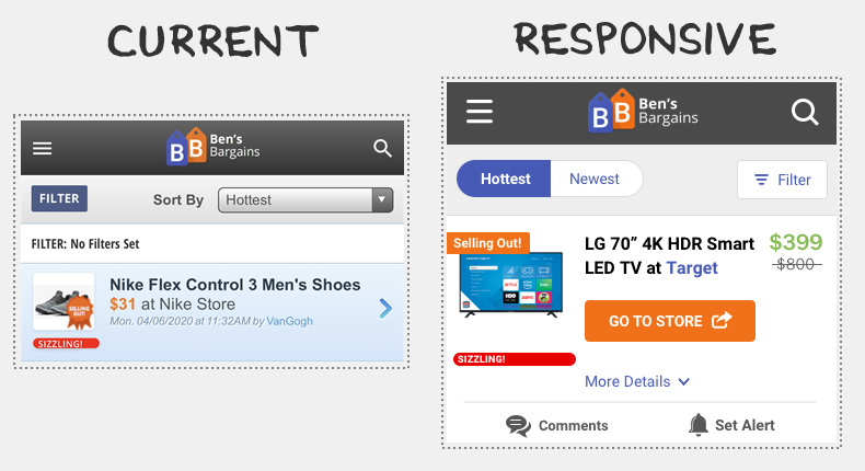
Here’s a look at the current design versus the new responsive design of the main deal box when on a mobile device. This is on the home page when browsing on a smartphone:
Responsive design helps us speed up loading times on the site. Some of our early testing has been showing significant loading time improvements, ideal for users that want to snag the best deals before selling out.
New mobile features include:
-
- The ability to “Go to Store” directly from the deal feed. Previously, you had to load the deal page to take advantage of the deal.
- The ability to click a drop-down in the deal feed to see the description / info related to the deal. Previously, you had to load the deal page to read the description.
- The ability to set a deal alert in the deal feed. Previously, you had to load the deal page to set an alert.
- The ability to keep your location in the deal feed. All deal details can be expanded / read without leaving the feed. Previously, going back from the deal page to the feed in your browser would restart you at the top of the feed.
Two important points:
- If you are already using the Ben’s Bargains mobile app, your experience will not change. The mobile app is separate from the version of the site that loads in a mobile browser on a smartphone / tablet.
- This won’t impact the desktop experience heavily. It’s primarily focused on mobile and tablet users.
Our schedule for pushing out responsive design to the remainder of the Ben’s will be happening in phases over the coming weeks. That’s going to include transitioning all of our deal pages, store, brand and category pages to the new design as well as search results
Ben’s Bargains is launching responsive site design soon. Here’s what that means for you